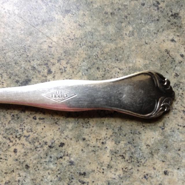
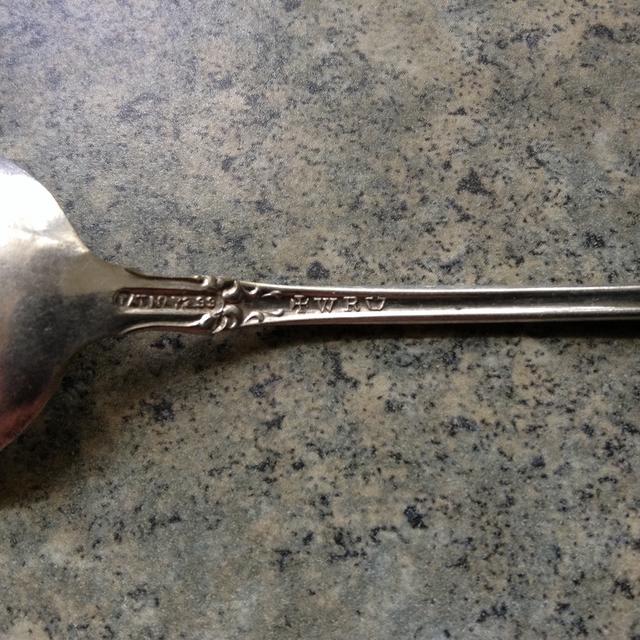
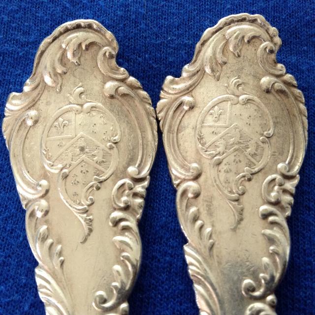
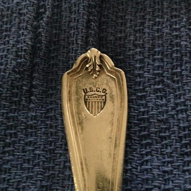
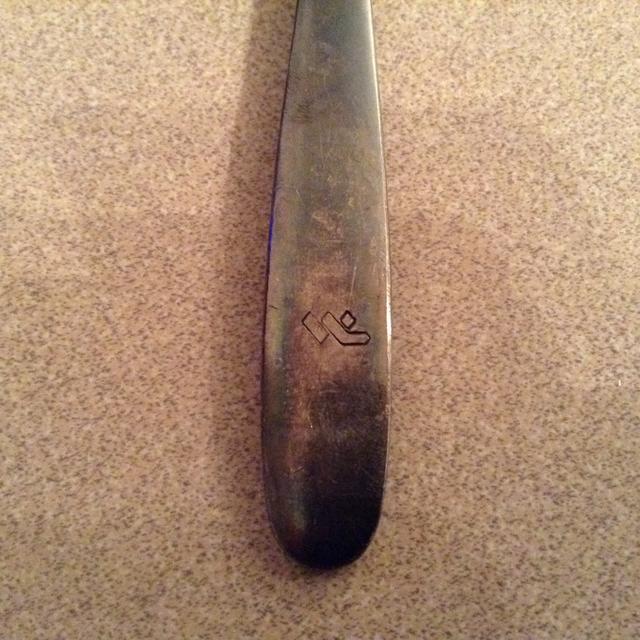
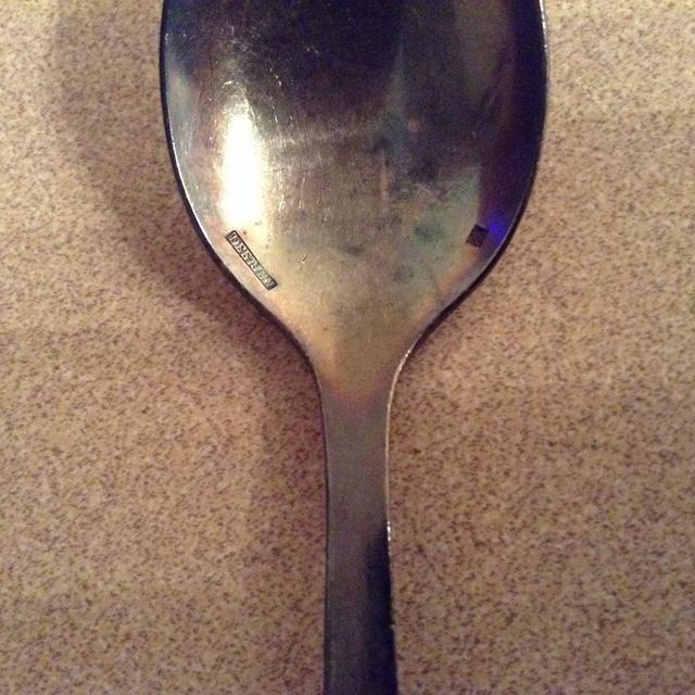
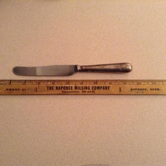
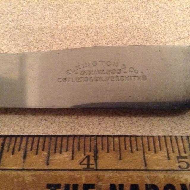
Some logos from hotel-style chinaware that may be an aid to identifying, worn or badly stuck, engraved commercial crests applied to hotel-type silverware:

Hotel Astor - New York City

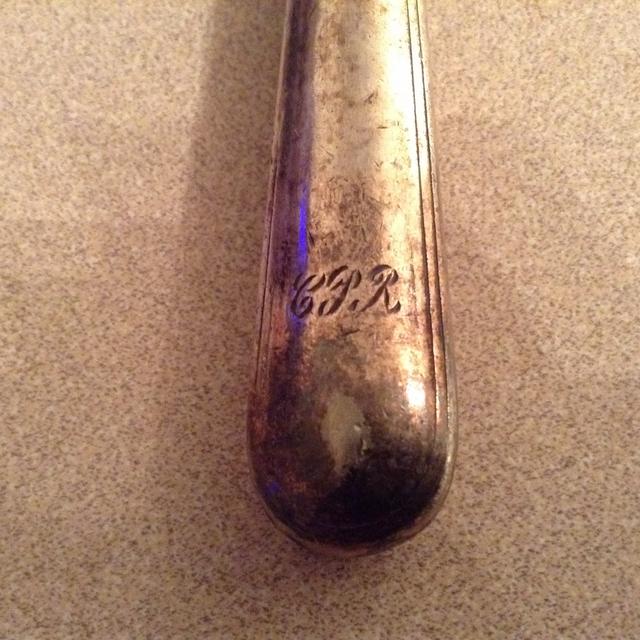
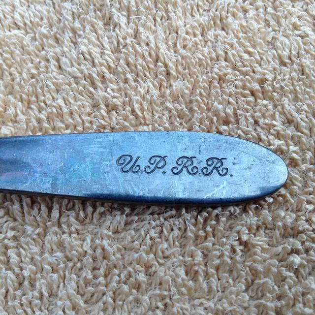
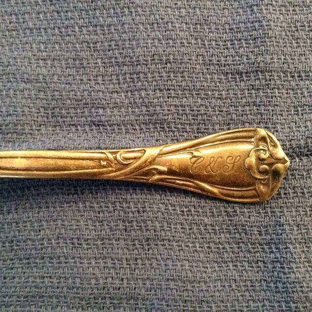
Atlantic Coast Line Railroad System

Automobile Club - Buffalo, N.Y.

Hotel Baltimore - Kansas City, Mo.

Blackstone Hotel - Omaha, Nebr.

Blackstone Hotel - Chicago

Hotel Book-Cadillac - Detroit

Erie Railroad System

Hotel Floridian - Miami Beach

Friedner's - Far Rockaway, N.Y.

Hotel George Washington - Washington, Pa.

Habana Yacht Club - Havana, Cuba

Hotel Roosevelt - New York City

Hotel Roosevelt - New Orleans

Hotel King Cole - Miami Beach

Manatee River Hotel - Bradenton, Fla.

Morrison Cafeteria Chain

Pennsylvania Railroad System

Hotel Vendome - Boston, Mass.

Vinoy Park Hotel - St. Petersburg, Fla.

Woolworth's Stores Restaurants
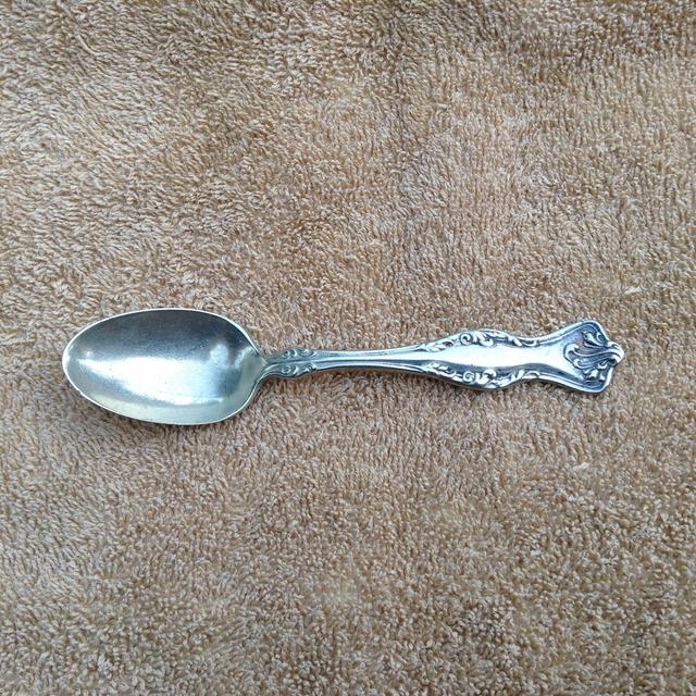
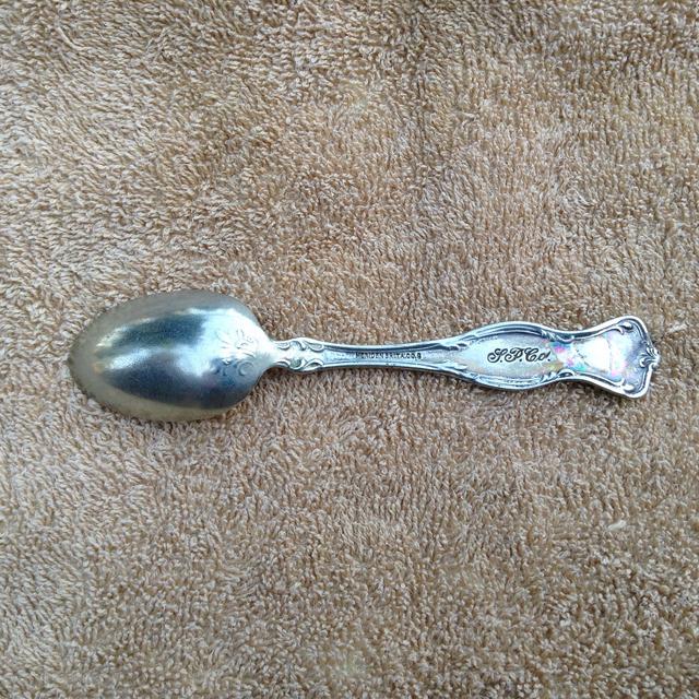
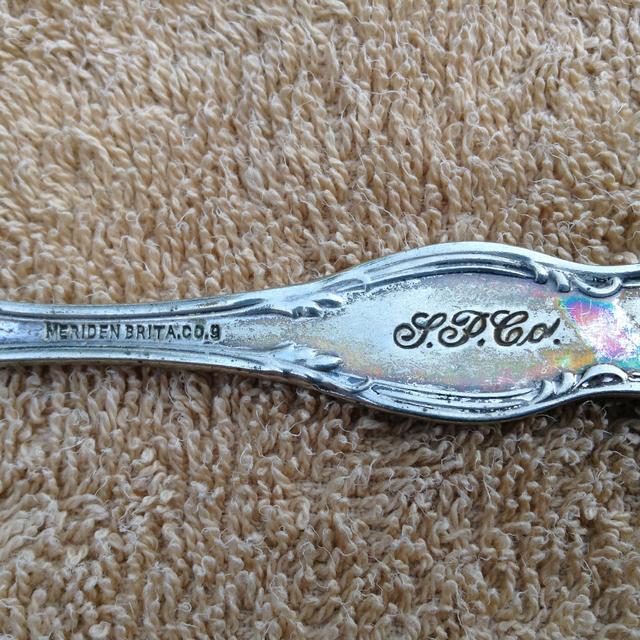
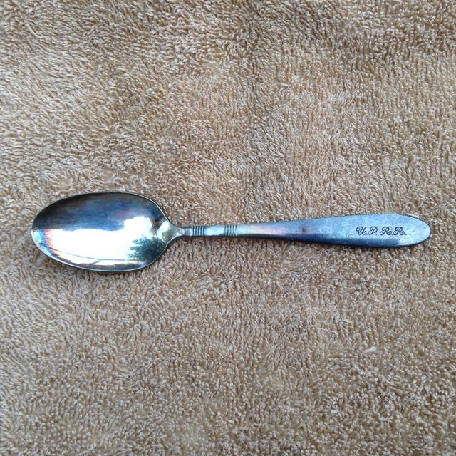
Some of the above images are not the best, but hopefully they provide some clues.
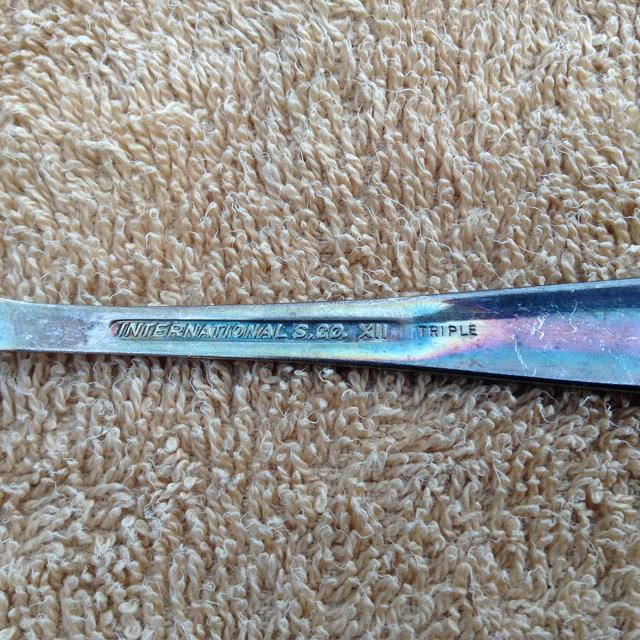
These designs are taken from the Albert Pick & Co. catalogue of 1926.
Trev.